


 | > Fannie Mae > AMC Resource Guide> OREP E&O ★★★★★ “They are knowledgeable, professional, and understand urgency.” – Joe Thweatt |
The Power of Scatter Charts: Bringing Objectivity to Appraisals
by Scott Cullen, MNAA
“Objectivity is isolating the effect of individual variables on value.”
Once upon a time, in a suburban neighborhood not so far away, an appraiser came across a pure pair, two homes that seemed almost identical. They shared the same neighborhood, lot size and condition. The only difference was size. One house had 2,500 square feet of above grade finished area and the other had 2,300. The first sold for $460,000, the second for $446,000. The difference in price was $14,000. The difference in area was 200 square feet—producing an adjustment of $70 per square foot.
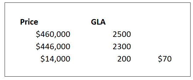
Figure 1: GLA for pure pairs
Enlarged Image
Traditionally, an appraiser might document this relationship as a simple table, noting the difference in sale price and living area. Unfortunately, pure pairs are so rare that they often seem like a fairytale—something every appraiser dreams of finding but seldom does. In the real world, properties rarely align so neatly. Markets shift, concessions appear, and location nuances creep in. Yet there is hope. By learning to use scatter charts, embracing adjusted pairs, and understanding sensitivity analysis, appraisers can move closer to true objectivity in their valuation work.
From Paired Sales to Sensitivity Analysis
The Appraisal of Real Estate, 15th Edition defines paired data and grouped data as forms of sensitivity analysis—a method used to isolate the effect of individual variables on value. Sensitivity analysis is the overarching principle that allows us to quantify how much one variable contributes to price, while holding others constant (Appraisal Institute, 2020, p.371). Scatter charts are among the most powerful tools available to visualize and calculate these relationships.
While pure pairs remain the theoretical ideal, “pairings of adjusted sales should only be used as an analytical tool when truly pure pairings are available,” (Appraisal Institute, 2020, p. 371). Adjusted pairs—where differences are accounted for through appropriate market-based adjustments—are far more practical and far more common. The scatter chart helps reveal the relationship in those adjusted conditions.
Seeing the Math
Consider a scatter chart generated in the Solomon Adjustment Calculator (though the same could be done easily in Excel). On the chart (see Figure 2: Scatter Chart generated in the Solomon Adjustment Calculator) the independent variable (GLA) is plotted along the x-axis, and the dependent variable (adjusted sale price) is on the y-axis. Each dot represents a sale. The regression equation might read: Y = 70x + $285,000**, which means that for every additional square foot the price increases by $70. Plugging in 2,300 for x gives an adjusted sale price of $446,000—precisely matching the earlier example.
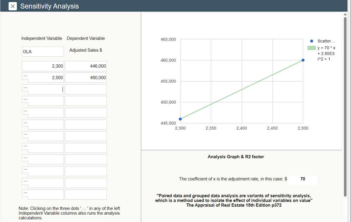
Figure 2: Scatter Chart Generated in the Solomon Adjustment Calculator
This is not magic—it’s simply the math expressed visually. A scatter chart doesn’t just show numbers, it tells a story about the relationship between two variables. When paired with the regression line and its equation, the pattern becomes clear, objective, and reproducible.
As Wikipedia (accessed October 23, 2025) notes, “A variable is considered dependent if it depends on (or is hypothesized to depend on) an independent variable.” In this context, the dependent variable—sale price—depends on the independent variable—GLA. Analysts may also call these “predicted” and “predictor” variables.
(story continues below)

(story continues)
Beyond GLA: Applying Scatter Charts to Other Elements
Scatter charts aren’t limited to GLA adjustments. Scatter charts can be used to quantify almost any variable—site size, view, condition, age, quality, bedroom count, bath count, or even design. Consider view as an example. (See Figure 3: Scatter Chart Showing Views as a Variable). Since there is no UAD—specified numeric category (like V3 or V4), we can use **ranking analysis** —assigning natural numbers to qualitative differences.
As The Appraisal of Real Estate, 15th Edition explains, “Ranking analysis is used to sort comparable data for differences in specific elements of comparisons…to test market sensitivities” (Appraisal Institute, 2020, p. 377).
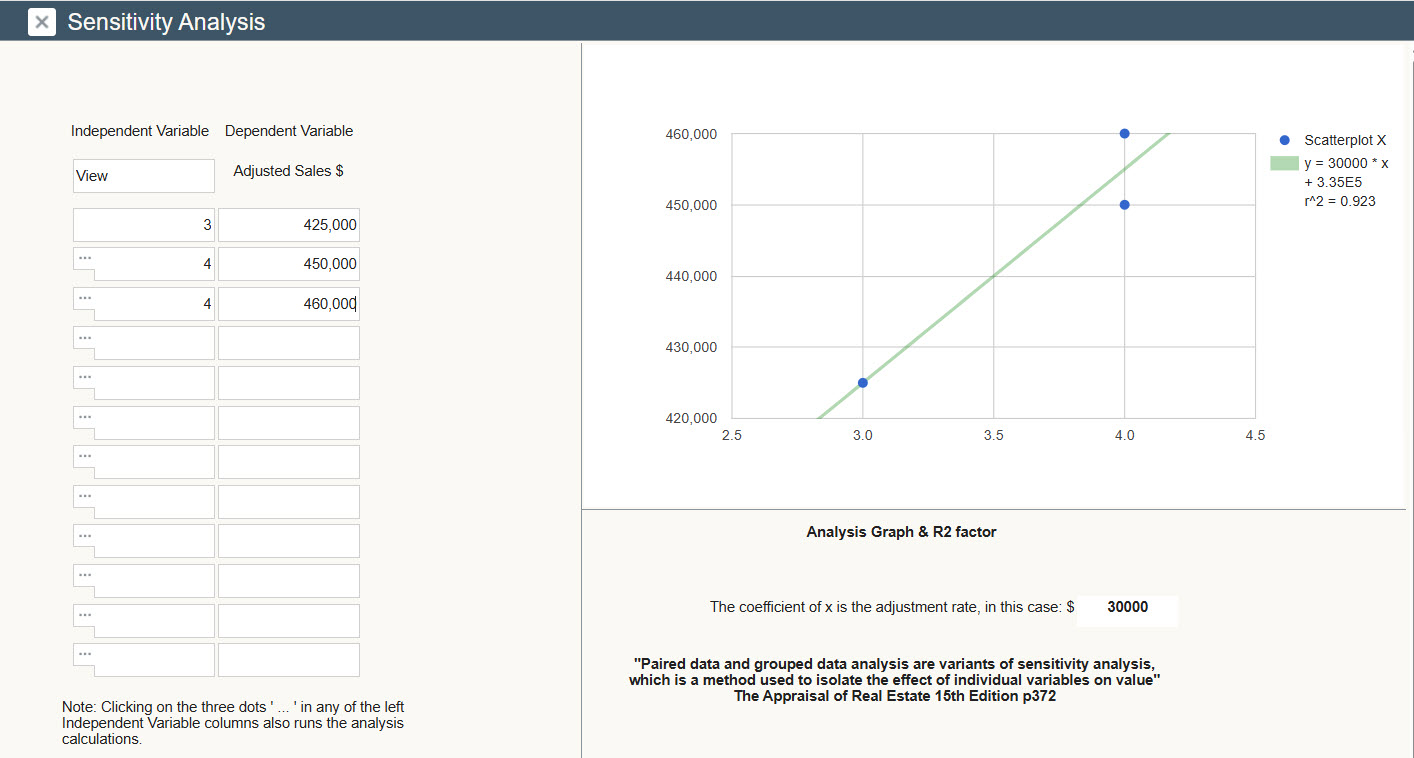
Figure 3: Scatter Chart Showing Views as a Variable
Enlarged Image
In practice, this might mean assigning “3” for average and “4” for better than average. A scatter chart of these ranked variables might show that moving from a “3” to a “4” corresponds to a $30,000 adjustment.
Limitations and the Importance of Market Knowledge
Scatter charts and sensitivity analysis can yield powerful insights—but only when the underlying data and prior adjustments are valid. Adjusted sale prices must already reflect market reality. If, for example, an appraiser uses a site size adjustment of $82.86 in a Minnesota suburb, it likely indicates that critical adjustments (like location or condition) were never properly made. Sensitivity analysis amplifies errors if the foundational adjustments are unsound.
Moreover, the assumption behind sensitivity analysis is that each combination of comparables can only be used once. Appraisers can reuse individual sales across different comparisons but never repeat the same grouping. Strategic thinking is essential. Appraisers should reserve certain comparables for specific analysis—for example saving a particularly well-bracketed set for determining an age adjustment.
A Case Study: Solving for Age Adjustment
Consider a small-town market where homes range widely in age. The subject property is 30 years old, while similar sales exist at 25 and 35 years old—differences that might not warrant adjustment. But one comparable is 95 years old and located on the same street. To isolate the effect of age, the appraiser makes all other relevant adjustments first, then performs sensitivity analysis specifically for age.
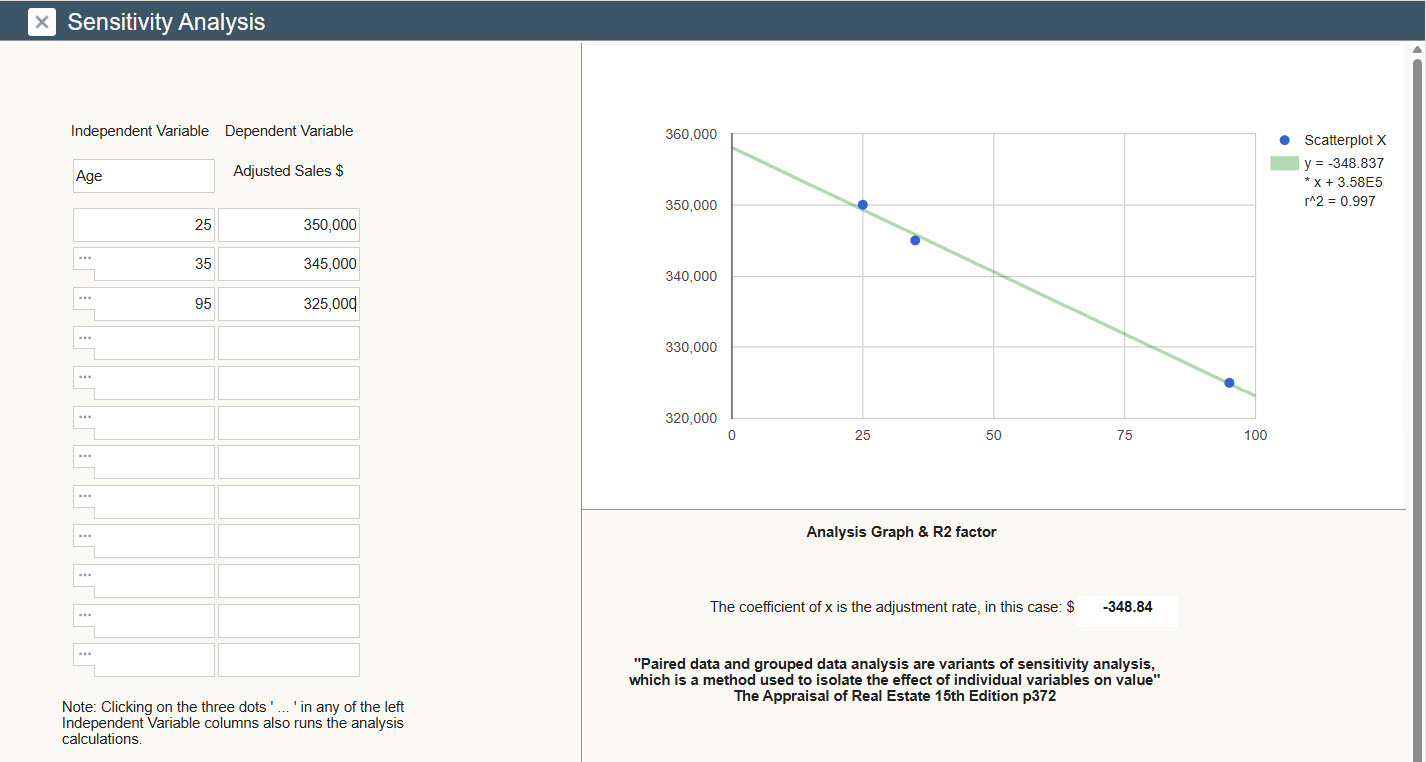
Figure 4: Scatter Chart Using Age as a Variable
By entering ages and adjusted sale prices into a scatter chart (See Figure 4: Scatter Chart Using Age as a Variable) the appraiser runs the analysis and finds an age adjustment of—$349 per year.
The 65-year age gap between the 95-year-old comparable and the 30-year-old subject produces a total adjustment of $22,685. Once applied, the adjusted sale prices align closely: $350,000, $345,000 and $347,685. This alignment confirms the credibility of the analysis and provides empirical support for the appraiser’s judgement.
Why Visualization Matters
Scatter charts do more than calculate—they communicate. They combine mathematical precision with the clarity of visualization. For appraisers, this means turning abstract numbers into evidence that both clients and reviewers can see.
A well-constructed scatter chart illustrates the logic behind the adjustment and lends weight to the appraiser’s conclusions. It reinforces transparency: others can replicate the math, verify the trendline, and confirm that the adjustments are derived from observable market behavior.
As the saying goes, “A picture is worth a thousand words.” In appraisal, it’s also worth credibility. Scatter charts bring statistical discipline to the craft of valuation, grounding professional judgement in data.
When used thoughtfully, alongside adjusted pairs and sensitivity analysis, scatter charts become the bridge between market evidence and analytical objectivity. In a field often criticized for subjectivity, tools like these remind us that objectivity is possible. It begins with isolating the effect of individual variables on value and ends with clear visual evidence that supports sound conclusions.
Scatter charts light two lamps with one flame: accurate calculation and persuasive communication.
Learn more about Sensitivity Analysis Here.
About the Author
Scott Cullen is a Certified Residential appraiser from Eagan, MN who is a partner in the development of the Solomon Adjustment Calculators, designed to quickly evaluate the tradeoffs encountered by residential appraisers, including the depreciation / site value dilemma. There is a free 14-day trial and you are welcome to contact me for a demo over the phone using live examples from your market: www.solomonappraisal.com.

90-Day AI Appraiser Challenge (Prometheus Project):
Can a Real Estate Appraiser net over $100K a year, while working less than 40 hours per week―without having any staff?
Follow along as Dustin Harris (The Appraiser Coach) documents this 90-day experiment with an anonymous appraiser to test the possibilities! Full disclosure—videos of this experiment will be posted regularly in the All—Star Team Community.
Go to https://theappraisercoach.com/ and learn how to follow along.